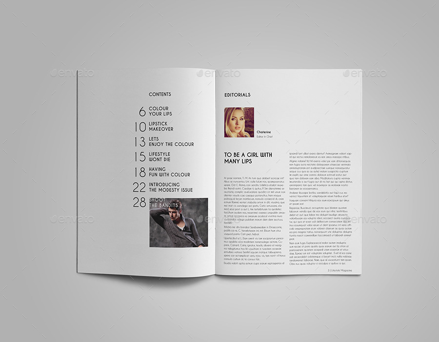
'Create a front cover and contents page of a new music magazine using Photoshop.'
With this project I feel I have loads of areas to explore with this one topic of magazine. I listen to a lot of music, so this can be a very broad subject where I have to pick a genre I feel will be best suited. By only designing the front cover and the contents page allows me to focus on small details and make sure that any features included relates well to what I'm trying to get across, it will give me full control over what people can see and how they interpret what is being represented. I haven't used Photoshop much before, but I hope from this new experience I will be able to develop my skill with the software and get a glimpse of what it's like to design a magazine professionally.
I intend on making my magazine relate to the music I listen to as it will have an honest approach towards how it's designed and a better understanding to the feedback I get. The genre would probably be either Hip Hop/R&B or Musical Theatre/Classical which I feel we don't see a lot of. I hope to make my magazine aesthetically pleasing and easy to look at, as well as being enticing with pops of colour and bold font, so that it can appeal to both genders.
Here are a few examples of themes that I aspire to incorporate into my magazine:
Media is definitely a platform which has the ability to alter the way we see things, whether this is with Photoshop or how they layout the text. What is on the cover can foresee the content of the magazine and immediately tells the viewer what type of magazine it is, whether it is music, fashion, lifestyle etc.
As we have focused on 'The Big Issue' this past term, it was only fitting to deconstruct one of their own front covers which regarded the situation with Brexit.
The cover displays the following politicians; Nicola Sturgeon (Scotland's prime minister), David Cameron (Britain's prime minister), Boris Johnson and Nigel Farage who were prominent leave campaigners.
Already knowing about the views of 'The Big Issue', it is very obvious that they would be against the idea of Brexit and they express this by using the politicians in a mocking form by using an inter-textual approach and replacing the ABBA members heads with theirs. The reason they could've done this is because ABBA was a Swedish band who were very popular in Britain in the 1970's and you could say that the EU really brings together Britain and Europe the same way ABBA did.
They have also associated famous song lyrics with a politician which also corresponds with the referendum. Nicola Sturgeon says "Breaking up is never easy, I know" this quote links well to the idea that if the UK leave the EU, Scotland will then be able to leave the UK meaning she gets something beneficial from Brexit. David Cameron has the quote "Knowing me, knowing EU" which is a play on the word 'you' again supporting the idea that 'The Big Issue' doesn't take the referendum seriously.
The cover includes gold, glitter floor where they stand upon. You could say it could just be a dance floor, however the connotations behind the gold could represent wealth and glamour. This detail could imply that if we were to leave the EU politicians like them may barely be affected by Brexit compared to the general public.
Overall, 'The Big Issue' has painted the idea of Brexit in a very negative light so that they can persuade you with more of a bias perspective. This is a good example because when you deconstruct the cover you can pick out all the ways they get their messages across.
Another magazine cover we could deconstruct is from 'Q' magazine where their focus is more towards the music industry.
From this magazine cover you can first see Jay-Z who is a very famous rapper and music producer meaning that this issue could concentrate on rap and hip hop, or even maybe new artists who are now on his label.
Another feature of the cover which is almost as prominent is the 'Q' logo. This allows us to instantly identify what magazine it is when purchasing. The typography of the cover is mainly red and from the colour theory post, red could symbolise importance. With many names printed in red shows that they are famous and are special features of the magazine. The font is also in a plain bold theme allowing words to be easily identified when reading above of the large image.
To conclude this post, I have found that magazines can hold a lot of implications if you pick apart various features and how they lay out on the page. Different magazines have different ways of getting viewers to purchase their product as well as appealing to their interests and this is done by colours and images.
I explored social, cultural and political context within 'The Big Issue' magazine, looking at different articles to observe how they report. As we already know, this particular magazine is not mainstream and mainly liberal, left wing, focusing on socialism whilst also promoting labour and liberal democrats. 'The Big Issue' is known for challenging the authority and being somewhat blunt so that it can fit in niches in the market.
The first article I read about was 'David Bailey: King's Cross Revisited'.
The idea was to photograph homeless people in King's Cross, London; where it had been discovered that it had been transformed by vast investment. What he had found was that the government has shown a lack in strategy in preventing and tackling homelessness. David Bailey described his findings as "an air of simmering misery and menace" showing that this is an important matter that
shouldn't be swept under the rug.
The second article was titled 'Will the poorest be better off after Brexit?'.
'YES'
Patrick Minford
Chair of Economists for Free Trade "The fall in the cost of living will benefit lower-income households"
The article explains that Brexit may have a positive impact on the homeless as it may support them and keep them living in good conditions. It suggests that the fall in the cost of living will benefit them because they spend a large proportion of their income on food and rent, of which will fall substantially. Patrick Minford (pictured above) believes that there will be economic benefits from Brexit of which will positively impact those in poor conditions.
Semiotics are signs and symbols and the interpretation it holds. I will discuss what denotations and connotations are and how they differentiate, as well as giving examples of signs and symbols applying what they can be interpreted as.
A denotation is the obvious meaning of the signifier or sign, compared to a connotation which is any other meaning that isn't that obvious. An example of this would be a 'tree'.
Denotation: A tree is spelt T-R-E-E, it has a trunk and branches which grow leaves.
Connotation: A tree provides us with what we need to live, also meaning that a tree could represent life with the way it grows over time.
Signs and symbols can be anything from a word to an image. The can be split into two labels, the signifier; which is the physical form that can be seen or heard and there is what is signified, this is the meaning of the form. Signs and symbols are all down to interpretation and vary depending where you're from, how you were brought up, personal links or what has been directly taught, all of these factors can alter our understanding of signs.
Using the same example of the tree, in this instance the word 'tree' would be the signifier as it what is being seen or heard. The actual tree recognised which is pictured mentally is what is being signified as it is the concept behind the word.
Another example could be the word 'rose' being the signifier, whereas the actual rose is what is signified. However the words passion, death or love could also be what's signified as it is a connotation of the word 'rose'.
So far during this part of the course we have looked at many magazines, but one we have focused on a lot is 'The Big Issue'.
This magazine is a charity magazine which is sold by the homeless throughout the week. Inside the magazine they like to address and deal with important issues that are occurring today in society. Their perspective is usually always from a socialist point of view to show that they are for the people and want to express their opinions in a way that feels honest and trustworthy to the general public.
The whole magazine brand has offered opportunities for people in poverty and severely struggling by allowing them to contribute to sales and making a job out of it to support themselves. With the amount of help and support 'The Big Issue' receives, it has boosted their sales to over 82,000 copies sold every week.
Representation is the way particular groups are re-presented/portrayed in the media. This can pass on various ideologies through the different forms of media, this could be done with imagery, words, colours and editing. The media has control over what is represented in the media as they can choose what is exposed and what is not, however we also have control because we have the ability to choose how we respond to these representations.
The main categories that are often targeted in the media are age, ethnicity, sexuality, gender and regional and national identity. With these categories, many industries have a vast selection of ways to approaching them so that whatever they are advertising appeals to that specific audience.
It is important that representation is broad and that every person is included in some sort of way depending on what the media company wants to portray. The way they may do this may seem very bias to one person but relevant to another but to be able to strongly influence an audience they need to look at situations in a particular ideological or value perspective.
To explore representation is more depth, we conducted a small observation to support the ideas of representation. We typed in a category on Google Images and we would gather similar features which related to certain stereotypes to see if there was a correlation in the way these categories were seen to the way they are thought of in reality.
The first category we looked at were Londoners. Being from London you tend to experience a very different characters so it can be difficult to place them under the same label, but looking on Google we have concluded a few things.
The positives were that we are a very diverse society who show responsibility for others especially through societal crises. Due to other diverse nature we have become a very cultured community who take pride in many of the celebrations that have been brought into the city which also connects well with individuals having a lot of confidence in self expression.
Some of the pictures did however put us in a negative light with the idea that in the city, because we are so busy inclined with our 'professional' lives that we have become secluded and disconnected from the people around us for example, the homeless, our streets and small local businesses.
Another category we researched were teenagers as it seems fitting. What we found that was quite positive, were that a majority of the images showed them to be quite happy and open about self expression. This was a bit surprising as I had assumed there would be images of rebellious kids and technology and even though i know that isn't entirely true in reality, I suppose that the idea is just the media planting stereotypes into my head.
The negatives were again a little shocking as there was a severe lack of diversity in ethnicity and gender whilst the superiority of the images being of white females. We had also discovered that a lot of the pictures were of the teens taking pictures or how they would look with their friends. Even though they seemed happy their behaviour seemed forced giving the idea of insecurity. Although the teens looked a little conceited taking pictures in a lot of the images, there could also be an element of vulnerability when being around this age.
Colour is an important factor when it
comes to media as it has the possibility of altering how viewers interpret what
their seeing as well as how they respond to it. When working with colours it
helps by know the different ways colours can be manipulated to express
different meanings.
To start with the basics, primary
colours are the backbone of every other colours this consists of Red, Blue and
Yellow. These hues can't be created by mixing any other colours together.
Secondary colours are colours that can
only be created by combining pure primary hues.
Tertiary colours are created when you mix
a primary colour and the nearest secondary colour.
Complementary colours are colours on
opposite ends of the wheel which is useful when something needs a more vibrant
feel to it. Even though pairs like these are good if you want something to
stand out they are don't work well when it comes to text.
Analogous Colours are more harmonious as the work
well because it uses the colours next to each other to be used in more serene
and comfortable designs. Usually they work with one colour being dominant, a
second being a support and then the third being an accent with either black,
grey or white.
Lastly, there are triad colours which
are simply colours that are evenly spaced around the colour wheel creating a
vibrant palette with carefully balanced colours.
When it comes to using colours, it isn’t
just what colours go with it, but also what the individual colour’s meaning is.
Depending on what message you are trying to perceive, you need to use the right
colour with the right connotations.
The main aspect of media is to try and get people to view something so that a message is passed along, whether this is newspaper, commercial music video etc. They all use a form of editing to get us to focus on specific areas and from what we have discussed as a class is that editing is everything especially when it comes shots, transitions and the mise en scene. Editing can be very difficult to analyse if you don't know what you're looking for because the idea of editing is that it's meant to be unseen and effortless allowing continuity or a natural flow to something. Editing is very important as it can very cleverly construct representations which can be very bias or so vague that you interpret it on your own.
History of editing
Before editing, a film would only be one shot rolled continuously until the end with no breaks or transitions. When editing was first used; it was nothing more than an accident, but as time went by the idea was explored and experimented with so that it could be useful and allow more meaning to films. Editing started to become very popular for propaganda, persuading people to join the army, causing discrimination by portraying obstructive, bias views on another party.
Although editing could be used for quite negative presentation, it had a rightful part to play in the film industry where it was considered that actors and editing worked hand-in-hand and the audience had the opportunity to give a film their own meaning. An example of this would be The Kuleshov Experiment with Eisensten and Kuleshov:
Or even Alfred Hitchcock's example which supports the Kuleshov Experiment:
Both of these examples show that context is key and it really depends on how the viewer interprets what they see.
Editing at one point was done by cutting out a frame from the film and then sticking the remaining film back together, this was known as cut film. Nowadays editing software can be purchased for free and is very easy to comprehend where you no longer need to be a professional, but can be just your everyday YouTuber. An example of this would be videos by Zach King who uses editing in a very creative way for brief entertainment.
Camera Shots
Camera placement is probably a lot easier to identify for example when watching a movie sometimes you want to see where a character is looking and you can only see it if the camera focus' on it, that's when you realise that the shot has changed. There are many types of shots and I will explain them briefly.
Extreme Close Up: Can be used for seeing very small details on faces or objects, for example in horror films you can see blood or in advertisements promoting clear skin. Big Close Up: Perfect for picking up on facial expressions or any form of emotion which is not obvious in their body language for example when a person is becoming nervous. Close Up: Good for hair and make-up, allows anything from the shoulders up to be captured and viewed. Medium Close Up: Captures from the torso upwards allowing us to also glimpse as to what is surrounding the focal point. Medium Shot/Medium Long Shot: Allows you to see from the knee upwards, similar to the medium close up, but more is included into the frame. Long Shot: Usually contains the more of the focal point rather than the surroundings, for example the whole body of a person is shown. Very Long Shot: Taken from a far where more of the surroundings are in shot as well as the focal point. Two Shot: A shot presenting two (or maybe more) people at one usually creating a relationship between two characters.
Over the Shoulder Shot: A shot really good for making the viewer feel as though they are the 'third person' in a conversation adding another perspective to a situation without actually being there, also known as objective treatment.
Camera Angles
Zoom: Where the shot transitions from a long shot to a close up or a close up to a long shot. Usually used to create suspense or to give a dramatic feel by gradually focusing from a larger scale of a scene to a smaller scale. Dolly: The camera follows the focal point as it moves around. This is used in chases or in documentaries where they have hand held cameras to make it everything feel more raw and rushed giving a realistic element to everything.
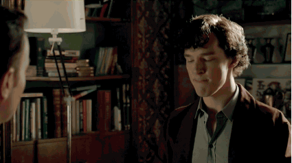
Pan: The gradual movement from one location to another without necessarily zooming or following anything in particular, but rather used to direct you to what main focus is currently. Low Angle Shot: When you're in a low position and you look upwards towards something higher than you in a diagonal alignment. An example could be you as a bystander as someone jumps from a high building.
Suicide scene from Sherlock
High Angle Shot: When you're in a high position and you look towards downwards towards something lower than you in a diagonal alignment. An example could be from the perspective of standing at a balcony and looking down towards the ground.
The Royale from 'James Bond'
Birds Eye View: A shot looking straight down towards the ground. Worms Eye View: A shot looking straight up towards the sky.
Establishing Shot: A shot that builds up context for a scene, for example a location like a bedroom or a street.
Transitions:
Cut: A very quick transition which instantly goes from one scene to another usually done without noticing.
Cross Dissolve: This transition is quite a gradual transition from an image to another which almost resembles a fade out and in.
Wipe: One shot is replaced with another shot by moving from one frame to the side of another which can usually be done with a special shape. One of the most popular would be on PowerPoint presentations.
Fade to Black/White: Pretty self explanatory; where the scene cuts to black or white. Black usually is used for a quick location change, dramatic change or a blink and then the character finds that they're somewhere else.
White is more for a dream like state or a daydream and sometimes even a very gradual death.
De-focus: Where the camera blurs out the a main focus point by focusing onto another scene. An example of this could be in a film or show which may contain explicit scenes that aren't going to be shown, the camera may blur out what is actually happening and transition into another scene.
Montages: A compilation of events put together to represent a long time period, but reduced into a smaller time frame. Usually with music played relating to the subject at matter.
Here's a montage from 'The Vampire Diaries' which was fanmade by I-fandoms:
The 'Male Gaze' is a theory by Laura Mulvey in 1975 who wrote an essay called 'Visual Pleasure and Narrative Cinema'. This was to evaluate a specific type of editing and she concluded from this theory that there is an 'unequal' representation of the way women are viewed where they are seen as sexualised for the pleasure of men.
This video following shows the 'Male Gaze' being put into action in a compilation of teen movies.
Mulvey created a triangle which explained the 3 areas of the 'Male Gaze':
1) The look of the camera as it records the filmic event
2) The look of the audience as it watches the final film product
3) The look of the characters at each other in the visual images of the screen illusions
Many aspects of the media use the 'Male Gaze' as it audience seem to have a large response when it includes sexualised scenes. Media uses techniques like voyeurism as a way to give an insight it what we may not really see in reality, for example scenes in the bathroom where women are seen to be quite vulnerable are exploited to concentrate on their body and movements.
The following is a scene from 'Carrie' which uses voyeurism to portray a sense of innocence by using an idea usually carrying sensual connotations by allowing her oblivious, timid state to counteract that.
Most of the time when women are viewing images in the media we don't tend to realise the perspective we are looking at it in, just what we are looking at. When you focus on who you are seeing, you notice that you are observing a women the way a man would and subconsciously start believing that it is the way a woman should look and behave. This is very misleading representation for a woman to interpret as we don't have control over how we see another woman, we just know that we don't look like 'them' having us believe that this is what men want us to look like.
Although the 'Male Gaze' is widely popular in the media there is also a theory called the 'Female Gaze'. This idea is similar - if not a parallel similarity, in the perspective of a woman where they see men in a sexualised manner, typically with their shirt off and very toned muscles. If the media is trying to target a female audience they will attempt to use the 'Female Gaze' to attract us. The only difference you could say which creates a gap between the two theories is that a major part of the media industry is ran by men leaving us with the question, is it really the 'Female Gaze'.If mainly men are creating the 'Female Gaze' then they can easily construct an ideal viewpoint on their own gender and what us women should be attracted to.
Films like 'Magic Mike' and music videos like 'Call Me Maybe' act as evidence to support this theory of there being a 'Female Gaze'. Another example would be 'Twilight' where it contains many shirtless scenes, and the fact that there is a compilation of them all supports this point further.
Overall, what I've learnt so far about the male and female gaze is that editing is important, but what we take is far more important. We should really think about what we view and not let it just sweep our minds because someone else's perspective can really become our own if we let it.