After brainstorming different features for my magazine front cover and contents page. I have designed a flat plan for each incorporating the ideas from my target audience and focus group.
Front Cover

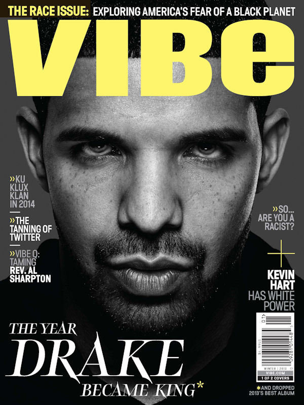
For my front cover, I want the image of my model to be at the very back and on the right with a retro, black and white, 90's filter over it so that it can have an old school style similar to old R&B and Hip Hop magazines. The font for the masthead is going to be quite urban, similar to graffiti style used in 'Fresh Prince of Bel Air' which allows it to target an older and younger audience as it can remind them of that show and time period. I used the X from where it dots the 'i' as a logo as it has continuity for the magazine and is easily recognizable. The subheadings are mainly going to be in black bold lettering so that it stands out depending on how important it is whilst important names are going to be highlighted in yellow. I want the magazine to have swatches of yellow throughout as it is an energizing colour connoting joy and stimulates mental activity, so information is taken in better. The yellow will also be used with the dividers between each cover line to, again, bring continuity, but separate different articles. I made sure that the left third contained the logo as well as the models name for easy recognition, however the bar code with the price is located on the right as I feel the price shouldn't entirely be the first thing you see as it may turn the reader away. Lastly the slogan is place right under the masthead so the reader understands the main objective of the magazine and that there is a direct correlation between the brand of the magazine and its market.
These are some magazines and themes which influenced my magazine:


Contents Page

My contents page is going to have the same model in however this time she will be on the left hand side, but facing right so she is not making eye contact with the reader. Her stance is still quite relaxed but the level of her importance is prominent in the way she is on both the cover and contents page. I place the logo in the very back this time and it will have a low opacity so that the black doesn't clash with it and the font is still readable, it is also enlarged compared to the front cover just to emphasis that it is the logo. For the masthead, I used the same font as the front cover too, which again is for continuity. I separated the two words onto separate lines so that the models face isn't overly covered. The numbers are in a different font as it gives the magazine a little variation, this is also incorporated in the subheadings and also in the article information. I hope to include more of the yellow into the contents page, either in the subheadings or the numbers. For the subheadings, I tried to include the different features that were suggested by my focus group to show that I was took into consideration their ideas.
These are some images which influenced my contents page:


No comments:
Post a Comment